

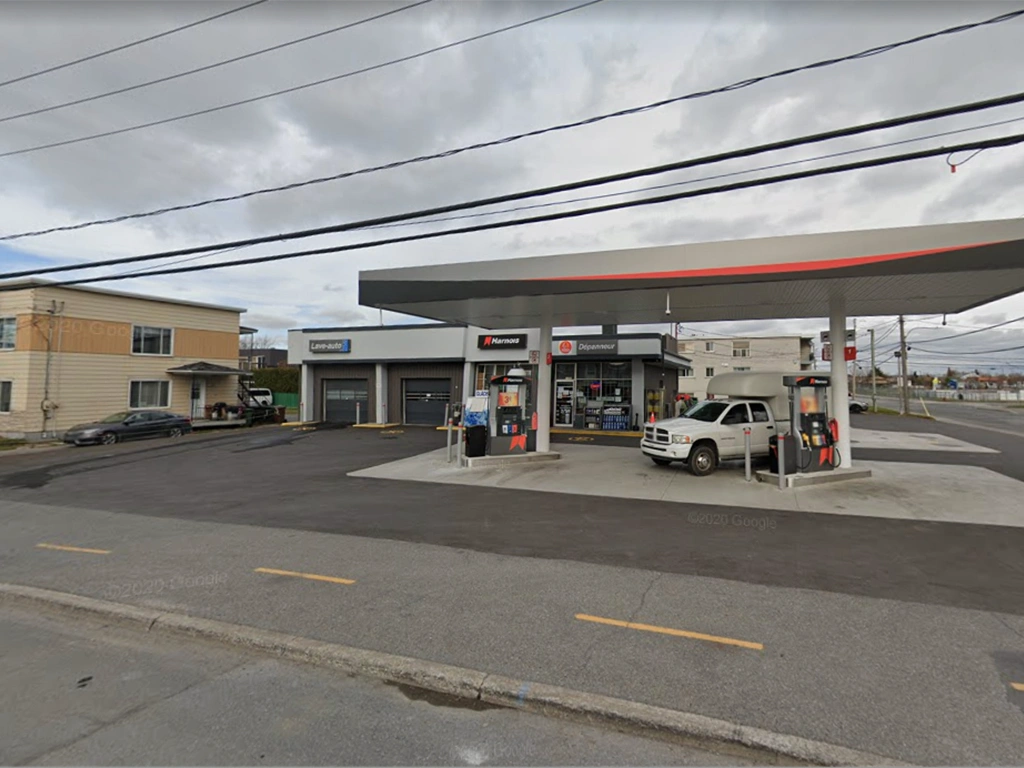
Dépanneur Phoenix, a gas station in Canada, sought a distinct corporate identity that would make their brand easily recognizable and visually appealing to customers.
Design Services and Impact:
We crafted the logo with an energetic palette of orange, yellow, and white, symbolizing warmth, energy, and dependability. These colors were chosen to reflect the station’s commitment to quality service and to enhance visibility, helping the brand stand out in a competitive market. The vibrant identity aims to resonate with customers and build a memorable presence for Dépanneur Phoenix.