
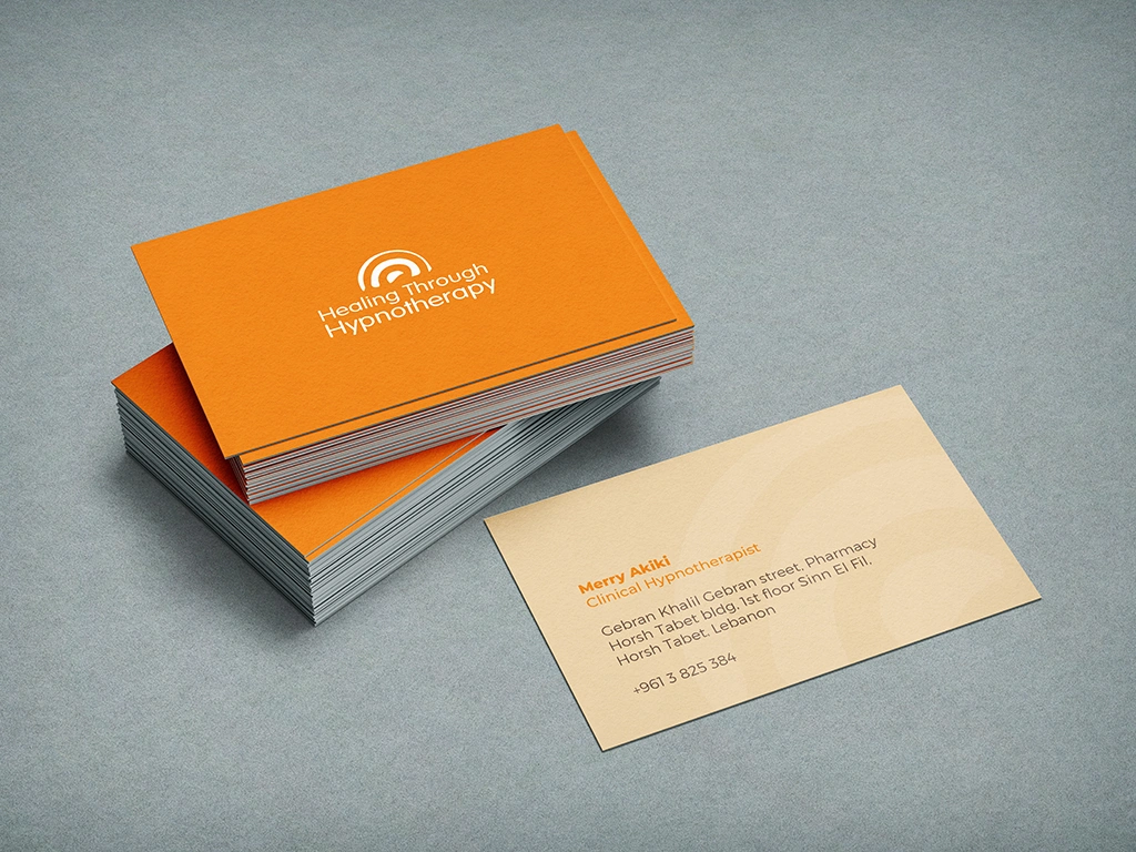
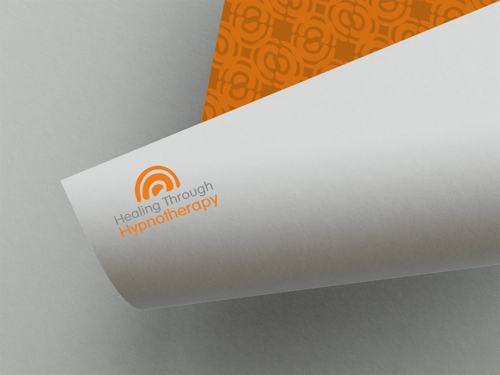
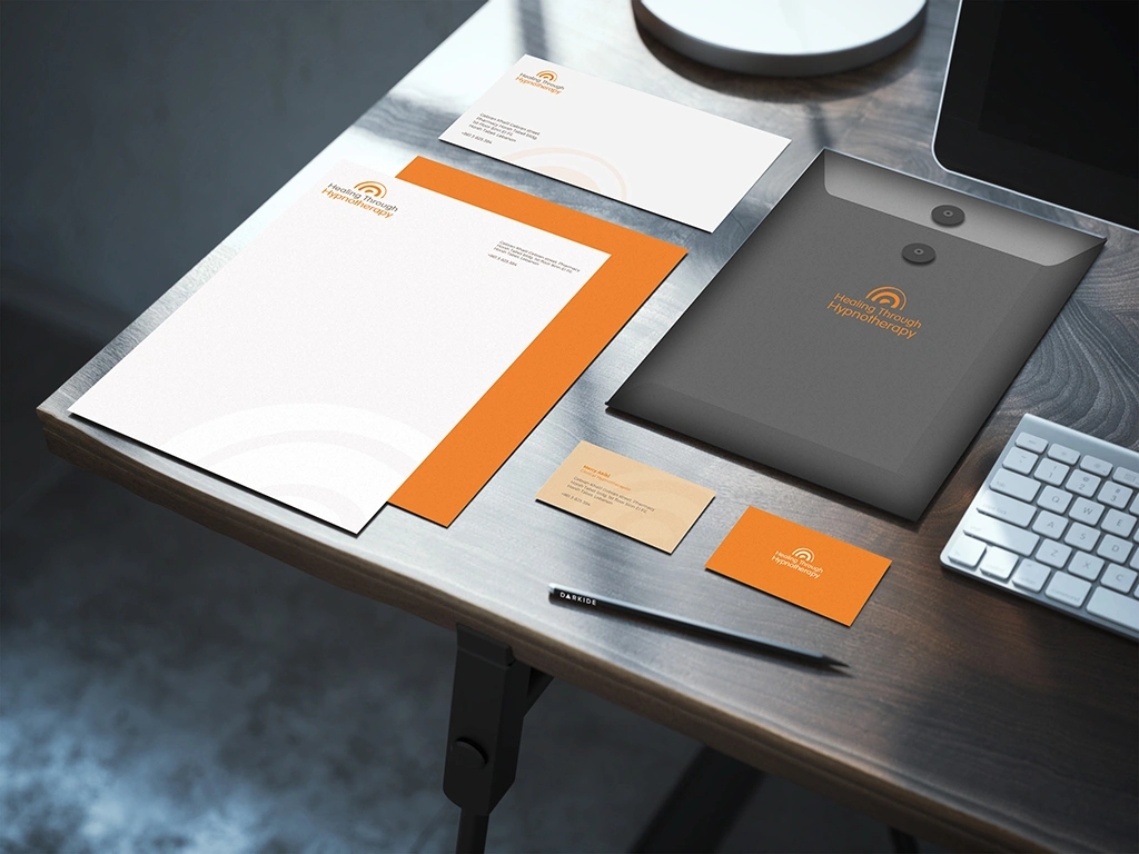

Healing Through Hypnotherapy, led by Merry Akiki, sought to rebrand its image, recognizing the need to evolve from its outdated identity. To achieve this, Mary crafted a new logo representing the brain and hypnotherapy waves in an abstract and evolutionary manner. Utilizing colors like orange for energy and creativity, along with beige, black, gray, and charcoal for relaxation and professionalism, the rebrand aimed to convey a sense of ease and trust to potential clients.
Design Services and Impact:
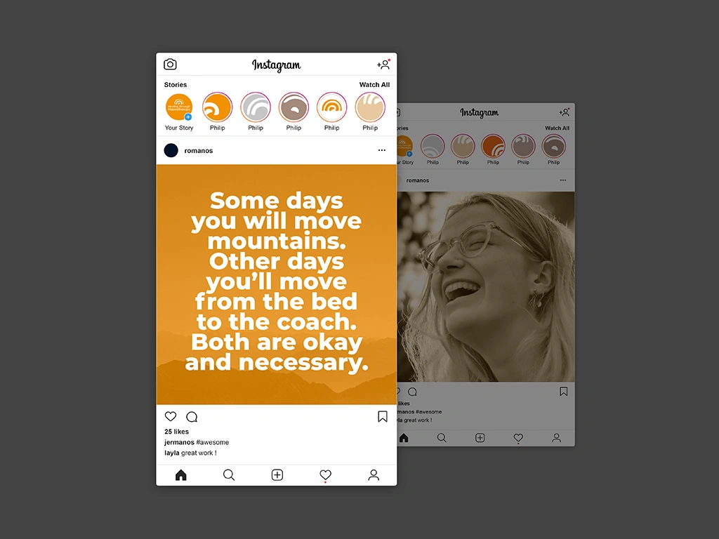
Collaborating closely with Merry Akiki, a comprehensive visual identity for Healing Through Hypnotherapy has been developed, including the logo, social media mood board/ initial posts and website. The logo’s abstract depiction of the brain and hypnotherapy waves symbolized the clinic’s transformative approach. The cold palette used was that of energetic effect and calm one. This rebranding effort resulted in attracting clients of higher caliber, reflecting positively on Merry’s expertise and the clinic’s reputation. The redesigned website further enhanced the clinic’s online presence, providing a seamless and informative experience for visitors, ultimately contributing to the clinic’s success and Merry’s satisfaction with the outcome.