The Saudi Squash Federation, the governing body for squash in Saudi Arabia, embarked on a mission to revitalize its visual identity, including its outdated logo. Founded many years ago, the federation sought a modern emblem that encapsulated the essence of Saudi Arabia while representing the dynamic nature of squash. The challenge was to create a logo that seamlessly integrated elements such as the iconic palm tree and squash racket, symbolizing growth and unity, against the backdrop of the Saudi Arabian desert.
Design Services and Impact:
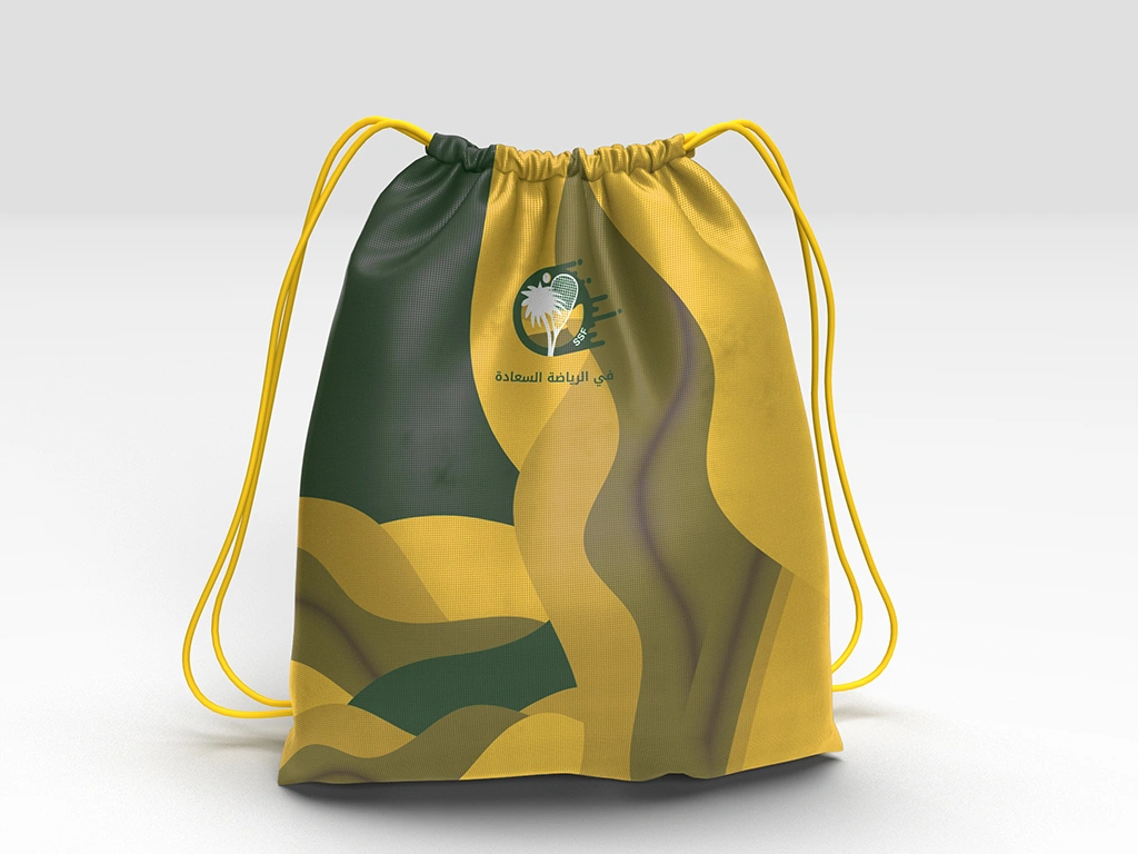
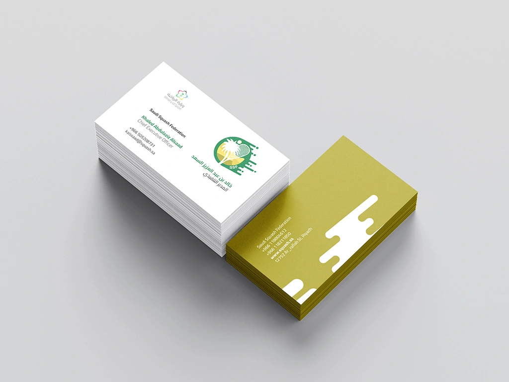
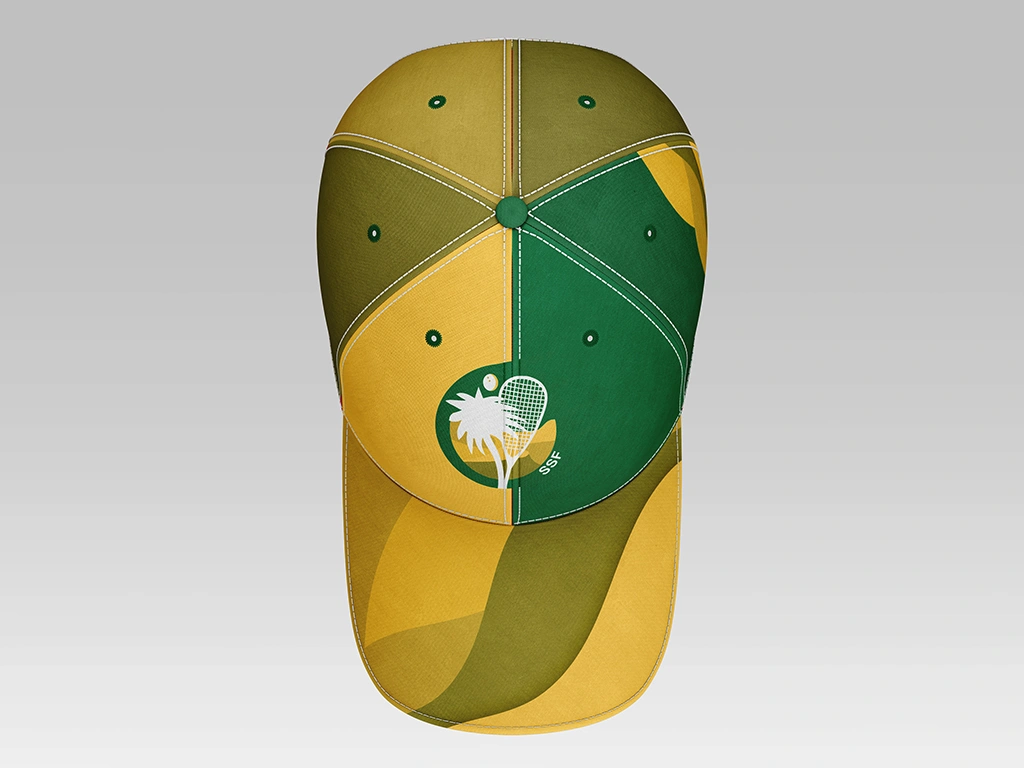
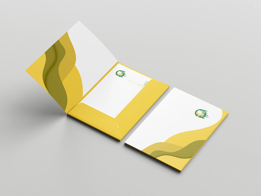
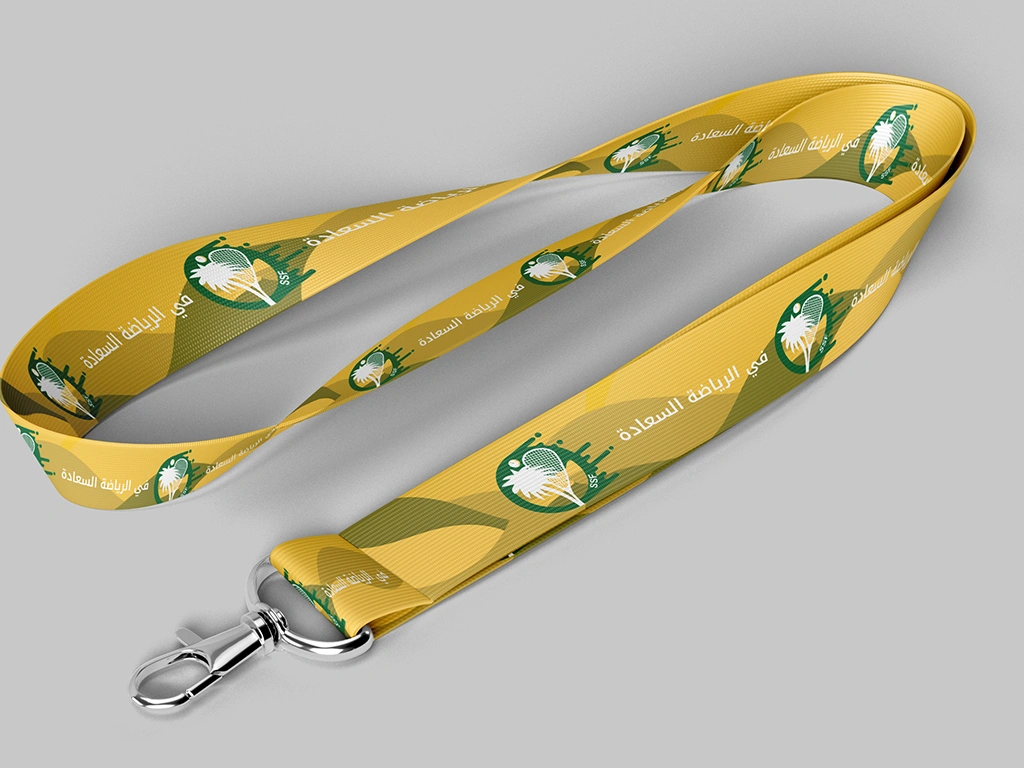
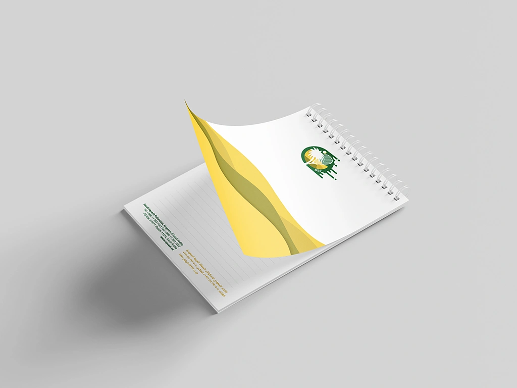
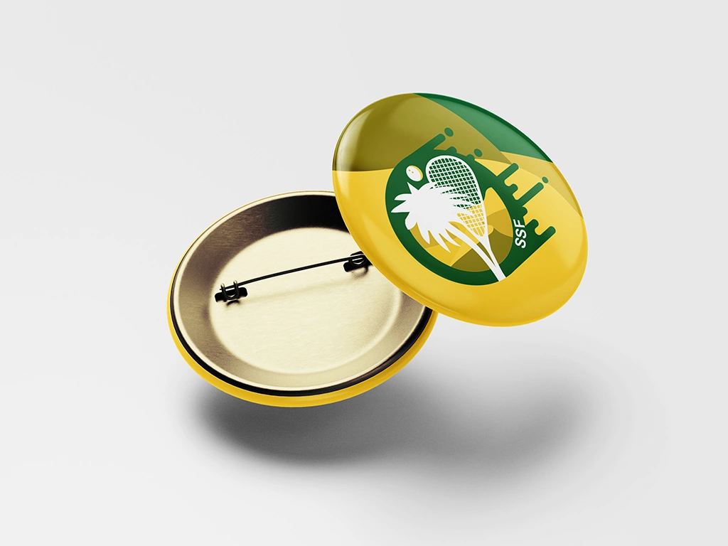
Inspired by the Squash Sport and its vibrancy Mary crafted a visionary logo proposal for the Saudi Squash Federation. The design concept seamlessly merged the palm tree and squash racket, depicting them as growing from a single stem to symbolize unity and collaboration. The inclusion of the Saudi Arabian desert background evoked a sense of place and heritage, while the dynamic lines conveyed the movement and energy of the sport. The color scheme, featuring golden hues and vibrant greens, paid homage to Saudi Arabia’s rich cultural landscape, with the palm serving as a quintessential national symbol. While this proposal awaits execution, it stands as a testament to our innovative approach to visual branding and our commitment to capturing the spirit of our clients’ aspirations.